Understanding the Basics of Responsive Web Design: Key Principles and Techniques
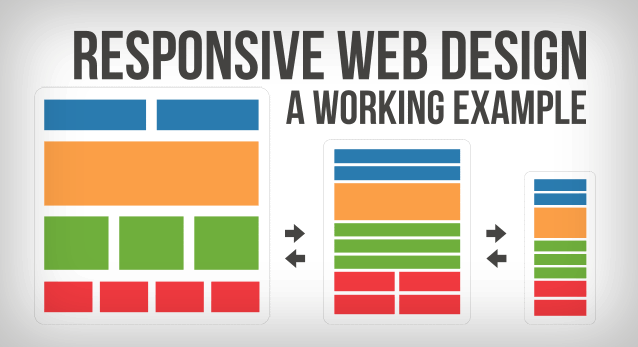
Responsive web design is an essential approach to web development that ensures websites function well across various devices, including desktops, tablets, and smartphones. This design philosophy hinges on the idea of using flexible layouts, images, and CSS media queries to adapt the website's appearance to the screen size. Key principles of responsive web design include fluid grids, which utilize percentages rather than fixed pixels, and adaptive images that resize according to the viewport. By implementing these techniques, web designers can create an improved user experience that caters to the diverse needs of modern users.
Another vital aspect of responsive web design is the use of media queries, which allow web pages to detect the characteristics of the device displaying the content, like its width and height. This capability enables designers to adapt styles for different devices, ensuring that users receive the optimal viewing experience. Additionally, adopting a mobile-first approach is recommended, where the design is crafted for mobile devices first before progressively enhancing the experience for larger screens. Ultimately, understanding these key principles and techniques of responsive web design will not only enhance your website’s accessibility but also improve its search engine ranking and user engagement.
The Impact of Responsive Web Design on User Experience and SEO
Responsive web design (RWD) has become a critical element in creating a positive user experience across various devices. As users increasingly access websites on smartphones, tablets, and desktops, a responsive design ensures that content adapts seamlessly to different screen sizes. This adaptability not only enhances usability but also encourages longer engagement times, which can lead to higher conversion rates. A well-executed RWD strategy allows for an intuitive navigation experience, ensuring that visitors can easily find the information they need, regardless of the device they are using.
In addition to improving user experience, responsive web design plays a significant role in SEO performance. Search engines like Google prioritize mobile-friendly sites in their ranking algorithms, making responsive design an essential factor for visibility. With a single URL for a website, all link equity is consolidated, allowing for better indexing by search engines. Additionally, sites with good responsive practices tend to exhibit lower bounce rates and higher engagement, signals that search engines interpret as indicators of quality. In this way, RWD not only enhances user experience but also boosts a site's SEO potential.
How to Optimize Images for a Seamless Responsive Web Experience
Optimizing images is crucial for achieving a seamless responsive web experience. As mobile usage continues to rise, having images that adapt to varying screen sizes not only enhances user experience but also boosts your SEO rankings. Start by resizing your images to the dimensions necessary for your website layout. Tools like image compressors can help reduce file sizes without sacrificing quality, making your pages load faster. Remember, faster loading times lead to lower bounce rates and improved engagement.
Another essential aspect of image optimization is using the right formats. For instance, JPEG is ideal for photographs, while PNG works best for images requiring transparency. Additionally, implement responsive images using the srcset attribute in HTML to serve different size images based on the screen resolution. This strategy ensures that users on mobile devices receive appropriately sized images, which contributes significantly to a smooth browsing experience.